
Why Pantone’s All-White Colour of the Year Has Designers Seeing Red
Pantone’s decision to crown Cloud Dancer—a soft, almost-white hue—as its latest Colour of the Year has landed like a splash of cold primer on a culture already drowning in rental beige and Instagrammable minimalism. Designers are split between calling it a quietly radical “blank canvas” and dismissing it as, in one viral jab, “Pantonedeaf.”
The backlash isn’t just about colour charts; it’s about class, taste, and what it means to live in spaces that look more like mood boards than homes. Is Cloud Dancer a thoughtful reflection of the cultural moment, or proof that the colour authorities are stuck in a very chic, very white bubble?
How Pantone’s Colour of the Year Became a Cultural Weather Report
Since the early 2000s, the Pantone Colour of the Year has evolved from an industry in-joke into a fully fledged pop-cultural event. Each December, Pantone unveils a shade that’s meant to capture “the global mood,” and within months you can see it echoed in movie posters, fashion campaigns, tech accessories, and interior design showrooms.
Past choices like Ultimate Gray + Illuminating (2021), the periwinkle-leaning Very Peri (2022), and Viva Magenta (2023) leaned bold, colourful, and easy to meme. Cloud Dancer, by contrast, is nearly the absence of colour—somewhere between gallery white, rental magnolia, and the background of a design app you haven’t started using yet.
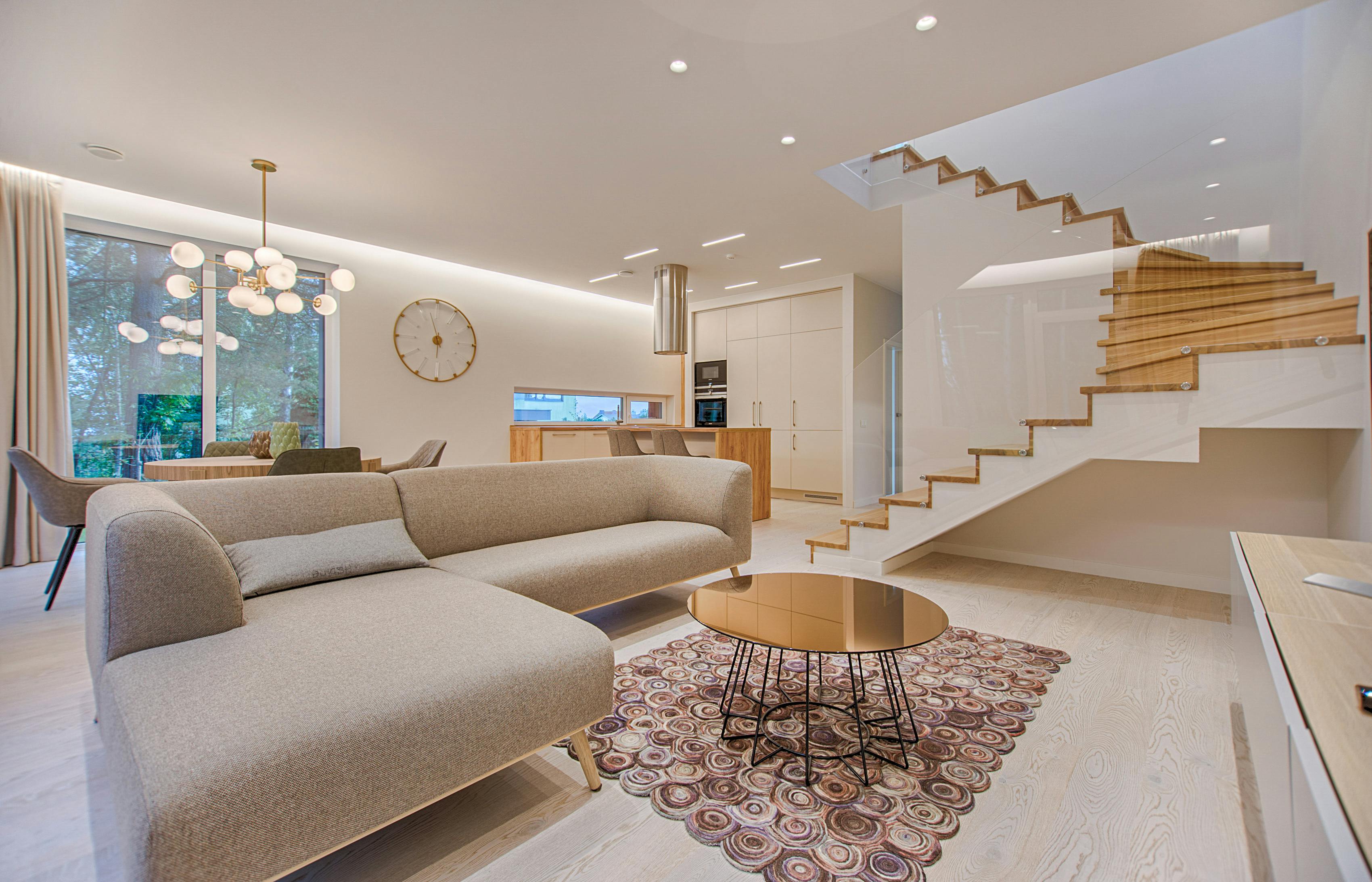
What Exactly Is Cloud Dancer, and Why Does It Look Like Your Landlord’s Paint Swatch?
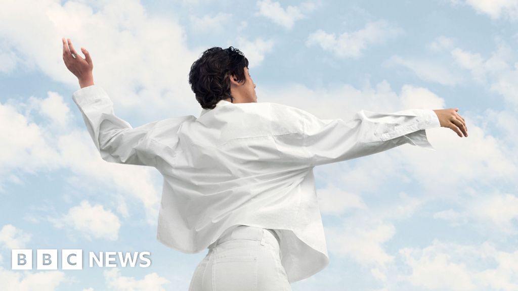
Cloud Dancer lives in that ambiguous zone between white and the faintest whisper of warmth. It’s not the icy gallery white of tech offices, nor the yellow-tinted magnolia of every shared flat in the 1990s. Think washed cotton, morning light on a white sheet, or the kind of wall colour that makes your plant collection look suspiciously photogenic.
In Pantone’s own language, colours like this are typically framed as pure, calming, and timeless. The broader design market has spent the past decade chasing that vibe: Scandinavian-inspired minimalism, Japanese-influenced “warm neutral” palettes, and #aesthetic TikTok rooms that all start with a white wall and a dream.
“Cloud Dancer is not about absence, but about possibility,” one colour consultant explained, arguing that the hue offers “a reset point in a visually overstimulated culture.”
That’s the official pitch: Cloud Dancer as palette cleanser, a gentle visual deep breath. But online, many saw something else— an aesthetic already overused, over-filtered, and closely associated with a very narrow vision of taste.
“Pantonedeaf”? Why the All-White Choice Sparked Backlash
The phrase “Pantonedeaf” started flying around social media within hours of the announcement, as critics questioned both the visual choice and the symbolism of celebrating whiteness—however subtly—in 2025.
- Timing: At a moment when conversations about representation, diversity, and visibility are central across film, fashion, and art, picking an almost-white shade felt, to some, like narrowing the narrative rather than expanding it.
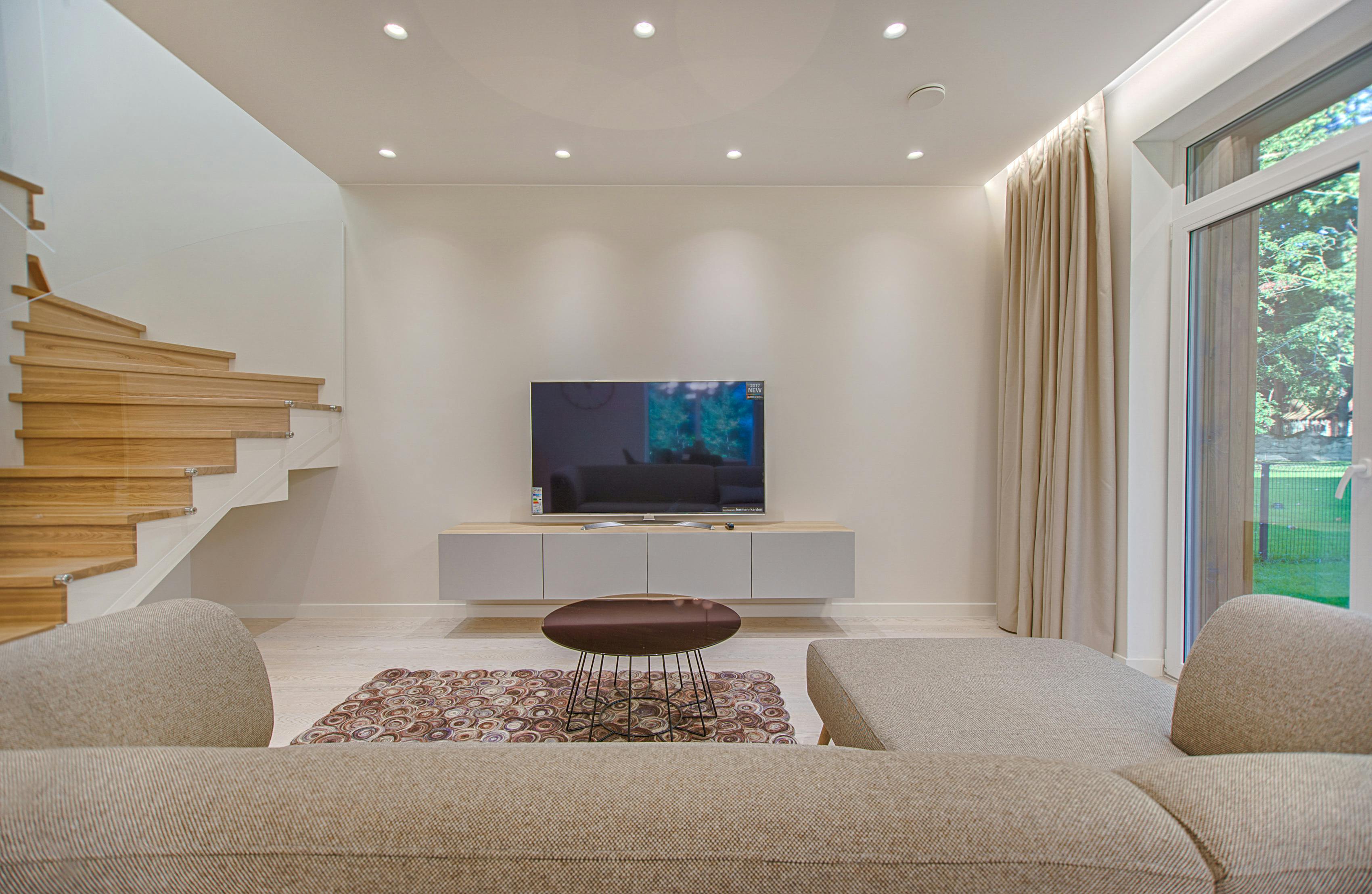
- Class and lifestyle optics: The Cloud Dancer aesthetic—sunlit, clutter-free, neutral—has become shorthand for a certain kind of aspirational lifestyle tied to high rents, careful curation, and everything staying suspiciously smudge-free.
- Design fatigue: Many designers and renters are frankly tired of white walls, associating them with restrictions rather than freedom.
“We’ve been trapped in Cloud Dancer for years,” one interior designer joked. “The idea that this is the future feels less visionary and more like my last ten rental agreements.”

On platforms like X and TikTok, Cloud Dancer was quickly memed as the official colour of “landlord special” interiors and corporate lobbies. The critique is less about the hue itself than what it seems to endorse: a visual culture that prizes sameness, safety, and a kind of bland, universal “good taste.”
In Defense of Cloud Dancer: A Versatile Blank Canvas
Not everyone is sharpening their paint rollers in protest. Many designers argue that condemning white misses the point. In the hands of someone thoughtful, a soft white like Cloud Dancer can be liberating rather than limiting.
Supporters tend to emphasize three key strengths:
- Versatility: Cloud Dancer pairs with almost any accent colour, from saturated jewel tones to earthy browns and greens.
- Light and space: In small homes and flats, a warm white helps reflect natural light and make spaces feel larger and calmer.
- Showcasing objects: For people who collect art, books, or colourful textiles, a quiet backdrop pushes the focus onto the objects rather than the walls.
“White is never just white,” a colour theorist commented. “Temperature, texture, and context turn it into a narrative. Cloud Dancer can be cold or comforting—it depends who’s telling the story.”
From this angle, Pantone’s choice reads as strategic: after years of punchy headline hues, an understated, almost invisible colour invites people to think about surfaces, light, and texture instead of chasing the next bold accent wall for social media.
What Cloud Dancer Means for Design, Fashion, and Pop Culture
The Colour of the Year is partly prediction, partly self-fulfilling prophecy. Once Pantone speaks, marketing decks follow. Expect to see Cloud Dancer echoed across:
- Interior design: More “soft white” furniture, ceramics, and lighting pitched as calm, mindful, and sustainable.
- Fashion editorials: Monochrome white styling, especially in spring–summer campaigns, photographed in overexposed natural light.
- Film and TV: Production design leaning even further into pale, airy colour palettes for prestige dramas and lifestyle-forward reality shows.
- Tech and branding: Packaging and UI design that leans heavily on white space and minimal colour, framed as “focus-friendly” and “clean.”
The risk is that Cloud Dancer accelerates a trend toward sameness: endless “timeless” white interiors on real estate listings, influencer apartments that blur into one globally shared mood board, and cultural spaces that feel a bit too interchangeable.
Cloud Dancer’s Report Card: Subtle Strengths, Significant Blind Spots
Judged purely as a colour, Cloud Dancer is hard to hate—it’s functional, elegant, and surprisingly flexible. Judged as a cultural statement for 2025, things get more complicated.
- Strengths:
- Extremely adaptable across interiors, fashion, and product design.
- Works well with sustainable, low-clutter, low-consumption aesthetics.
- Invites focus on light, texture, and objects rather than the wall itself.
- Weaknesses:
- Feels out of step with calls for more visible diversity and vibrancy in visual culture.
- Strongly associated with rental fatigue and corporate minimalism.
- Risks reinforcing a narrow ideal of “good taste” tied to privilege and space.
On balance, Cloud Dancer feels less like a visionary proclamation and more like an acknowledgment of where a big slice of design culture already lives: in rooms that are soft, pale, and carefully non-committal.
Rating: 3 out of 5 – aesthetically solid, culturally cautious.
Where Do We Go After Cloud Dancer?
The most interesting response to Pantone’s white Colour of the Year isn’t to reject it outright, but to treat it as a prompt. If Cloud Dancer really is a blank canvas, what gets painted on top—and who gets to decide?
Expect a counter-movement: richer pigments, maximalist interiors, and designers explicitly pushing back against the “everywhere white” aesthetic. At the same time, many people will quietly keep their soft white walls and just add more personality—bolder art, louder fabrics, and stories that go beyond a carefully edited neutral grid.
In that sense, the backlash to Cloud Dancer may achieve what Pantone hoped the colour would do: spark a conversation about how we actually want to live, and what our spaces say about us, long after the trend forecasts have moved on.
