
Cloud Dancer to Claret: 8 Interior Paint Colours That Instantly Upgrade Your Home
As Pantone announces its Colour of the Year for 2026, the conversation around paint is shifting from “What’s trendy?” to “What actually feels good to live with?”. Shades like Cloud Dancer, soft claret reds, peach-tinted neutrals and gentle browns aren’t just Instagram bait – they’re tools for building calmer, more grounded homes.
Inspired by the BBC feature "‘Cloud dancer’ to Claret: Eight paint colours that can easily transform your home", this guide breaks down the key hues designers are leaning on right now, why they work psychologically, and how to use them without accidentally repainting your living room three times in one month.
Pantone’s 2026 Colour of the Year and the Mood of the Moment
Pantone’s annual Colour of the Year has become a kind of cultural weather report. From 2020’s Classic Blue to more recent, softer tones, these shades reflect how we want our lives – and our rooms – to feel. The 2026 pick sits comfortably in a broader movement: serenity over statement, tactility over gloss, and a strong desire to make homes feel like sanctuaries rather than showrooms.
That’s where hues like Cloud Dancer (a soft, almost clouded off‑white), earth-inflected browns, and mellow peach come in. They’re less about look at me and more about quietly supporting everything else in the room – furniture, art, books, and, crucially, the people living there.
The BBC’s coverage of trending paint colours underlines a key shift: walls are becoming softer, less stark, and more textural, giving furniture and textiles room to shine.
“The Backdrop, Not the Hero”: Rethinking How We Use Paint
“Paint colours are a backdrop on which to layer, rather than the hero. Mixing tones allows for a more organic styling of our spaces.” – Christian Bense, interior designer
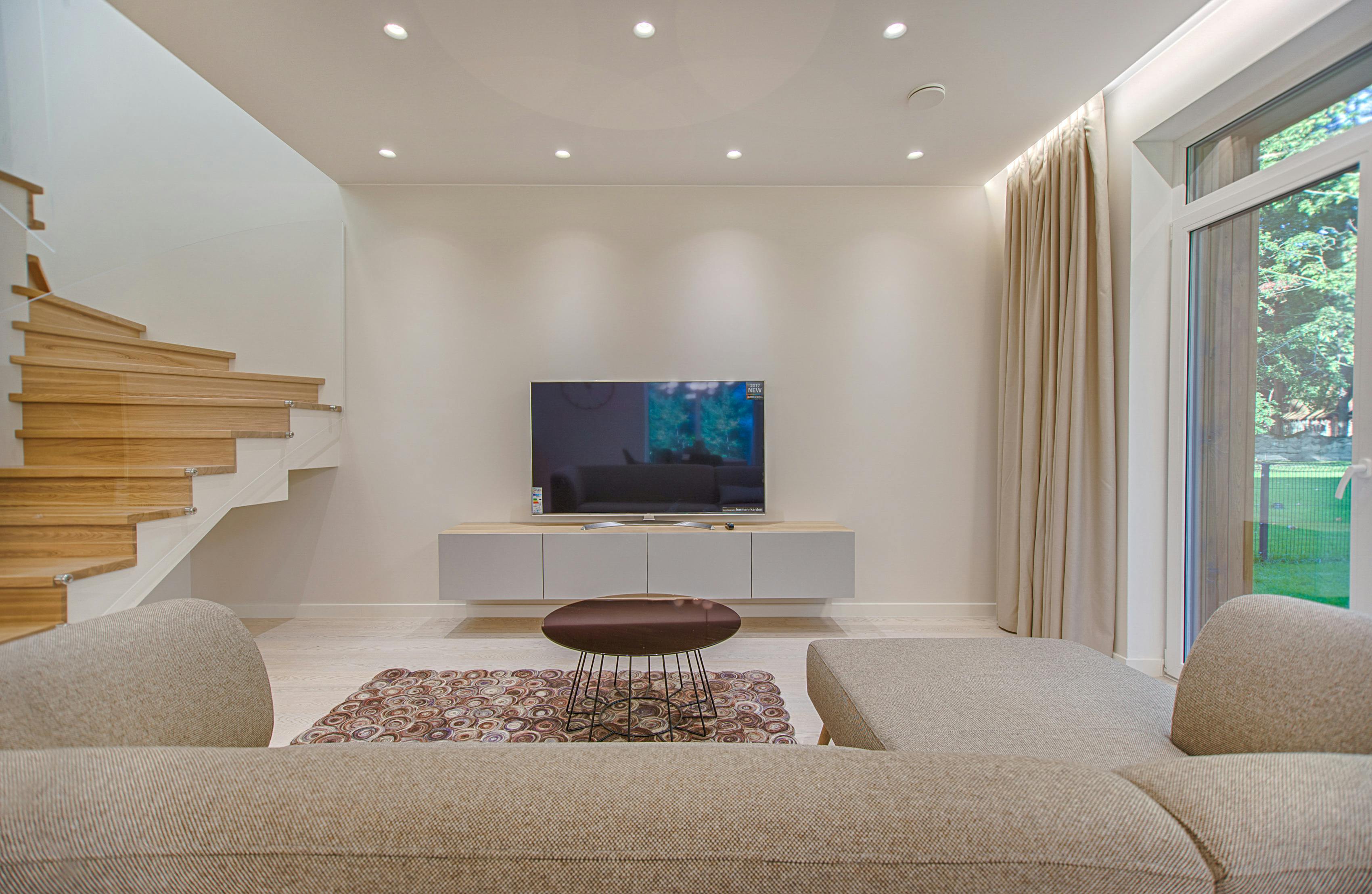
Christian Bense’s point is crucial: the most livable rooms rarely rely on one “star” shade. Instead, they stack related tones – a soft brown wall, cream trim, a peach-toned linen sofa – so the space feels grown-up and effortless rather than overly coordinated.
- Backdrop colours – quiet, low‑contrast shades like Cloud Dancer, warm whites, and light taupes.
- Accent colours – deeper tones such as claret, forest green, or inky blue for depth.
- Bridge colours – peaches, putty pinks, or mushroom taupes that connect warm and cool elements.
Eight Paint Colours Transforming Contemporary Homes
Below are eight key shades and families that echo the BBC’s selection, plus how they play with Pantone’s 2026 choice and broader interior trends.
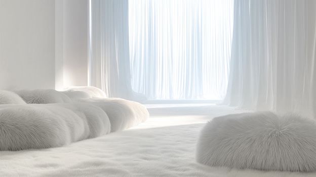
- Cloud Dancer and Cloud Whites
Think gentle, chalky off‑whites rather than gallery white. These “cloud” tones soften daylight and look luxurious with natural woods and linen. - Claret and Deep Wine Reds
Rich, slightly browned reds feel like candlelight in paint form. They’re strong, but when used in dining rooms or snug living spaces, they add a cocooning warmth rather than aggression. - Peach and Soft Apricot
As the BBC piece highlights, peach paired with creams and browns can make a room feel sun‑kissed even in grey weather. It’s also flattering on skin tones – handy for bedrooms and bathrooms. - Soft Browns and Mushroom Taupes
Earthy browns have stepped out of their 90s beige shadow. Modern browns are more mineral, often with violet or grey undertones, making them feel sophisticated instead of stuffy. - Cream and Warm Neutrals
Creams are the quiet workhorses of current colour trends. Look for ones with a touch of yellow or red to stop north‑facing rooms from going cold and flat. - Sage and Dusty Greens
Biophilic design – bringing nature inside – isn’t going anywhere. Sage and olive tones bridge wooden floors, plants, and stone surfaces seamlessly. - Inky Blues and Blue‑Greys
Deeper blues add drama without feeling shouty. They’re ideal for feature walls, alcoves, or cabinetry – particularly when you want contrast with softer whites. - Chalky Pinks and Putty Rose
These are not “nursery pinks”. They’re greyed, grown-up shades that behave almost like neutrals but bring a subtle glow to the space.
Off‑whites like Cloud Dancer come into their own when paired with strong texture: rough plaster, jute rugs, linen cushions and pale timber all pop against these subtle shades.
Colour Psychology: Why Peach, Cream and Soft Browns Feel So Calming
The BBC article highlights a trio that’s quietly everywhere: peach, soft browns and cream. Together, they mimic the colours of skin, stone, and filtered sunlight – a palette our brains read as safe and familiar.
- Peach adds warmth and a subtle glow, which is particularly helpful in cooler climates or overcast cities.
- Soft browns ground a space, making it feel steady and anchored rather than floaty and washed‑out.
- Cream bounces light around gently, acting like a soft-focus filter instead of a harsh spotlight.
Put together, they create what many designers call a “comfort palette” – understated, flattering, and almost impossible to clash with existing furniture, which explains their popularity in renovation shows and home magazines.
Bedrooms and living spaces benefit most from this trio, especially if you’re after a boutique‑hotel softness without feeling overly precious.
How to Use Trending Paint Colours Without Regret
Trend colours can be seductive on a screen and disappointing on a wall. Light, orientation, and existing finishes all change how a shade behaves. That’s why designers test obsessively – and layer.
- Test in real light – paint large swatches on different walls and view them morning, afternoon and evening.
- Pair warm with warm – claret, peach and cream sit best with warm woods and brass rather than stark black or blue‑white.
- Use darker hues strategically – deep claret or inky blue is perfect for smaller, cocoon-like rooms, joinery, or feature walls.
- Let neutrals do the heavy lifting – keep big surfaces in calm tones and bring bolder colour through art, textiles, and accessories.
Deep reds like claret excel in dining rooms, reading nooks and home offices where you want intimacy and concentration rather than maximal brightness.
How Paint Brands and Media Shape Our Colour Choices
BBC features, Pantone announcements and annual palettes from Dulux, Farrow & Ball and Benjamin Moore all feed into the same ecosystem. Social media then accelerates the cycle, turning a niche studio shade into a mainstream trend almost overnight.
Yet the colours that seem to stick around – cloud whites, warm neutrals, earthy browns – are the ones that work across styles, from Scandi‑inspired minimalism to more maximal, layered British or European interiors. That’s usually a sign they’re worth investing in, both aesthetically and financially.
- Explore the original BBC article for a deeper dive: BBC Culture – Home & Design
- Check film and TV set design on IMDb to see how similar palettes are used in contemporary dramas and period pieces.
- Compare paint brands’ colour-of-the-year picks via their official sites for a broader trend picture.
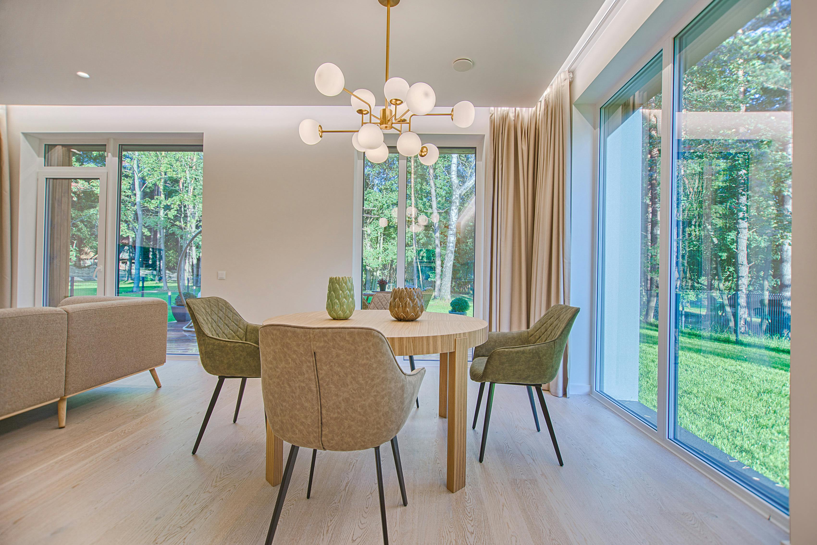
Kitchens and open‑plan spaces benefit from versatile neutrals that won’t date quickly as fixtures and appliances change.
See the Shades in Motion: Colour in Film and TV
If you want to see these palettes “in the wild,” watch how production designers use them in recent prestige TV and cinema. Cloudy whites and warm browns dominate in domestic dramas, while clarets and deep greens often appear in dining rooms, bars and hotel interiors on screen.
Many trailers on YouTube or official streaming platforms show this shift clearly – look for kitchens bathed in cream, bedrooms washed in soft peach, and living rooms layered in earth tones rather than stark monochrome.
Notice how the wall colour here quietly supports the mix of woods, fabrics and art, rather than fighting for attention – exactly the “backdrop, not hero” philosophy.
From Cloud Dancer to Claret: Choosing Colours You’ll Love Longer Than a Trend Cycle
The real takeaway from Pantone’s 2026 pick and the BBC’s highlight reel of hues is that we’re moving toward kinder colour – shades that make homes feel lived‑in, not just styled. Cloud Dancer whites, claret accents, and the trio of peach, soft browns and cream are less about impressing guests and more about making everyday life feel a little softer.
If you’re planning a repaint, start with how you want a room to feel – bright, cocooning, energising, or serene – and then borrow from these palettes with that mood in mind. The most timeless interiors aren’t perfectly on‑trend; they just happen to use colour in a way that feels honest to the people who live there.
Colour Trend Overview (Structured Data)
This structured data helps search engines understand the focus on BBC-inspired colour trends, Pantone’s 2026 announcement and contemporary interior paint choices.
